• Branding
  • Marketing
  • Websites
  • Portfolio
  • Words
  • Let’s Talk
  • Menu Menu

An Opportunity for Website Accessibility

August 15, 2017

A couple weeks ago, the ACS team attended An Event Apart in Washington DC. This post on accessibility is the second in a series about our takeaways from this web design and development conference. In case you missed it, check out our first post in the series on what makes industry conferences valuable.

A Story of Inclusion

For this AEA post, we’ll be highlighting Derek Featherstone, founder of SimplyAccessible. In “Where Accessibility Lives,” Derek led our journey through the eyes of an imaginary company called incrediWeb. This theoretical e-commerce startup was receiving user feedback that didn’t quite align with their perception of the incrediWeb site. For example, “the buttons are too close together” or “there is too much background noise in the video.” After several submissions of this nature, it became apparent to the company that their website had issues that made browsing (and buying) difficult for people with disabilities and personal restrictions.

The diligent team at incrediWeb knew accessibility was the answer, but they were faced with a whole new realm of questions… Whose job is this? Where do we start? What are we missing? How do we fix it? With virtually countless possibilities on the other side of the screen, it can certainly be daunting to plan for and satisfy all scenarios. According to Featherstone, the process can be broken down into three digestible steps:

  1. Forget Perfect – Aim for Better
  2. Start and Learn Quickly
  3. Research and Plan

From internal awareness to auditing their website to solving nearly 300 accessibility issues, incrediWeb utilized these steps to work toward an optimized experience for all visitors. It takes time – it takes testing – and it takes perspective, but the end result is well worth the effort. Derek left us with a quote he began his presentation with, now received with even greater meaning:

“Accessibility lives in people. Accessibility lives in process. Accessibility lives in tools.”

Man Using Laptop

Website Accessibility in a Nutshell

Let’s touch on the basics. Essentially, Website Accessibility isn’t a black and white concept (and we’re talking beyond the parameters of 508 compliance here). It’s not something you either have or don’t. It’s something you work toward – one page, one image, and one pixel at a time.

There are many steps designers and developers can take to ensure a website’s content is easily readable and navigable to those with special browsing needs. For instance, you might assume blind people don’t use the internet. Well, they do. How do you think one of the world’s 285 million visually-impaired people would fare on your website? Fortunately, as online standards and technologies have evolved, so has our understanding of addressing challenges like this and many others.

Derek introduced the scenarios of paraplegia, quadriplegia, farsightedness, nearsightedness, color blindness, dyslexia, hearing impairment, and the list goes on. It may not be possible to serve every single user an equally brilliant experience on your website, but your goal should be better – not perfect. Take the first step TODAY and implement these five simple, universal accessibility best practices:

  • Include descriptive ALT tags for all images
  • Buttons and link text should have a clear call-to-action
  • Provide generous spacing (white space) between elements on page
  • Ensure foreground and background colors have significant contrast
  • Create a logical tab order within menus, links and forms

It’s not difficult to make accessible choices in your code and design. The challenge is being aware of your visitors’ potential obstacles and addressing them effectively. Often, this requires research – something Featherstone believes in strongly. Your best guess might be better than nothing, but it’s not nearly as valuable as real feedback from real users.

Child Care Aware Website

Our Experience

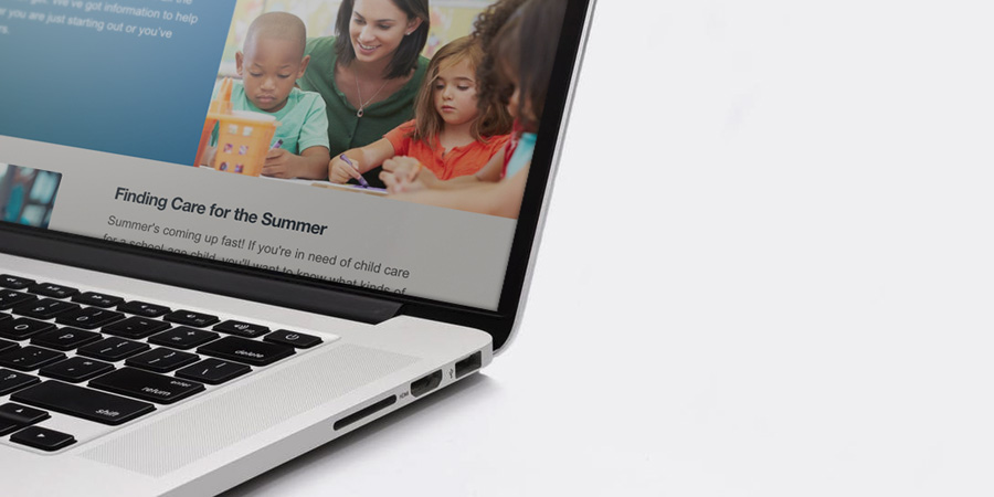
ACS designers and developers have hands-on experience creating accessible websites. One of our non-profit clients, Child Care Aware of America, helps parents find affordable childcare nationwide. When building their new website, we took extra care to ensure the site was easy to use for everyone.

Although it’s important to “aim for better” as Featherstone says, you sometimes have to aim higher when it comes to accessible website design. Our team built the Child Care Aware of America website to be 508 compliant. This refers to Section 508 of the Rehabilitation Act of 1973, which requires government-funded websites to be accessible to people with disabilities.

We deployed all of Featherstone’s best practices when designing this website. For instance, we avoided vague calls-to-action like “Learn More” in favor of more descriptive statements like “Read about summer care.” Our designers also used colors with significant contrast, to make sure text blocks were easy to read.

Unfortunately, there isn’t an automatic test to determine if a website is 508 compliant. There are no robots programmed to review your site. A person takes a look at each site and decides on a case-by-case basis if the website meets the law’s standards. However, if you take the right steps, you can build an accessible and compliant website. In the end, we’re proud to say that the Child Care Aware website passed the test and is 508 compliant.

Pile of Keys

Accessibility for All

What makes the web great is its universality. It connects, empowers and enlightens people from all walks of life in every corner of the globe. However, for technology to truly bring humanity together, it must be accessible for all.

As you know by now, we tend to get a bit carried away when talking about the awesome power of the internet. We’re not saying a site that sells pineapple t-shirts is going to change the world, but it does have the opportunity to provide an equally-friendly user experience to each of its visitors – and that goes a long way.

We’d like to thank Derek Featherstone (@feather) for his insightful wisdom and passion for website accessibility. Its importance will only grow by the day, and we look forward to making it our personal priority moving forward. Stay tuned for our next AEA post about progressive web design!

0 0 ACS Admin https://acsredux.acscreativedev.com/wp-content/uploads/2022/01/acs-logo-spot.svg ACS Admin2017-08-15 08:30:152017-08-15 08:30:15An Opportunity for Website Accessibility

Giving Healthcare Websites New Life Online

August 8, 2017

Healthcare websites are critical business and marketing tools in the medical arena. If yours isn’t driving-up patient numbers and facilitating workflow, then you might need a new one, stat.

When it comes to healthcare websites, ACS has the cure.

At ACS Creative, we have designed and developed dozens of websites for large healthcare companies, specialty practices and solo practitioners. We understand your specific challenges and use our deep expertise in healthcare marketing to create sites that solve them. Our mission is to allow you to focus on what you do best: building healthcare networks and healing patients.

Healthcare Web Design Examples

Take control of hospital networks and healthcare infrastructure.

Let’s say you’re an insurance company with information that needs to be delivered to providers, individuals, and facilities in a secure and efficient manner. At ACS Creative, we’ve got just what the doctor ordered. Our healthcare websites can be designed to address all audiences and manage multiple portals of data.

In fact, we did just that for Signature Partners, an integrated provider network. Patients, providers, payers, and other groups can easily access information pertinent to their needs. Doctors can learn about the benefits of joining Signature Partners while patients can search for in-network providers near them.

For InTotal Health Providers we took it a step further than just a healthcare website by creating a robust back-end provider platform for registrations and claims. These kinds of online tools help businesses streamline their operations – which increases bottom lines. The upfront costs far outweigh the endless financial advantages you’ll reap over time.

Aretech Healthcare Website

Tout medical innovations. People want to know.

Consumers search for medical information ALL THE TIME. As a forward-thinking member of the healthcare industry, you can use this to your marketing advantage. Having a blog that offers tips on common illnesses or first aid is a great way to drive traffic to your website and build brand awareness, both locally and nationally.

If you’re an oncologist, for instance, offer your take on the latest cancer research findings. If you’re a pediatrician, give new parents guidelines on care. The more valuable the information on your healthcare website, the more likely people will discover it, see your expertise and schedule an appointment.

Similarly, you may be a company pioneering innovative medical treatments, like our clients Scandic Health and Aretech. In this instance, a website can be an invaluable tool to help spread the word about your products and services. For Scandic, we designed a modern website that delineates all the benefits of MusiCure and gives visitors the ability to learn more, listen to a sample AudioCure and contact the company. For Aretech, we used how-to videos and sliding feature sections to communicate their product’s benefits in an engaging way. So far, the prognosis for both websites has been very good.

Scandic Health Website

Everyone needs a doc. Help them find you.

If you own a practice, you need a website that attracts new patients and keeps current ones coming back. That means your website needs to be mobile and tablet-friendly for those increasing numbers of consumers who research on the go.

Of course you want them to find you, but if your site isn’t mobile-friendly, Google will ensure that they don’t. This is Google’s rule, not ours, but our web design team knows how to build websites that major search engines love. At ACS Creative, we are also skilled at SEO and online marketing – which means we can help practitioners, clinics, insurance providers and other healthcare companies outrank the competition.

Set appointments, facilitate claims and more.

There are a number of medical practice functions that can be solved with intuitive healthcare website design. First, we can ensure that your office hours and ways to make an appointment are clearly denoted on the homepage. Nothing is more frustrating to people who need to make a doctor’s appointment than hunting around for basic information.

Check out this website design for South Riding Pediatrics. We highlighted hours and phone numbers in a sidebar that appears on every page. The appointment phone number is also in the header, site-wide. Parents with sick children have little patience for cumbersome websites, so we designed this one to be super user-friendly.

If budget allows, we can also build a custom appointment setter that integrates with your current appointment calendar and updates in real-time. This way, people can conveniently make appointments online anytime.

Submitting insurance claims, checking on their statuses and paying bills can also all be handled through your website. Imagine the time and paper your practice or clinic can save when you automate these functions through your website. Plus, it’s these kinds of conveniences that really drive loyalty and new patient acquisitions. For both patients and doctors, healthcare websites are all about efficiency.

Head over to see our portfolio full of our work in Healthcare Websites and much more!

0 0 ACS Admin https://acsredux.acscreativedev.com/wp-content/uploads/2022/01/acs-logo-spot.svg ACS Admin2017-08-08 09:15:012017-08-08 09:15:01Giving Healthcare Websites New Life Online

Make Your 404 More

July 18, 2017

As the Web continues to grow and evolve exponentially, getting “lost” has become increasingly common. You may be wondering how it’s possible to lose your way in the digital space while so comfortably anchored to your office chair in the physical realm. If you’ve ever been confronted with a website’s 404 Page (the internet’s dead end), you know the helpless feeling that follows. Clearly, you’ve wandered off the beaten path and now, with “Page Not Found” glaring at you in extra large typeface, you have little hope of ever finding your intended destination. It’s safe to say that website just lost a visitor…

What is a 404 Page?

Without getting too technical, a 404 Page is an automated error message that appears when a user attempts to access a page which doesn’t exist on a particular website. Essentially, the server could not find the file requested. This can occur when the visitor types an incorrect filename after the URL, clicks an outdated hyperlink, or tries to access a deleted page. Some content management platforms and themes provide a mildly-branded 404 Page and others just display an unformatted white screen with black text. Either way, more often than not, a “Page Not Found” almost always results in a customer not happy.

Missing Website Page

Embrace the Opportunity

Because so few sites spend the time to customize their 404 page, people’s expectations are quite low. Any effort above and beyond a white background with intimidating black text will be a welcome surprise for your visitors. Not only should this revelation be a big relief but also spark some creative inspiration as well. Remember, your 404 page isn’t really public-facing, nor is it indexed in search engines, so have some fun with it!

Dennys Funny Page

As website owners, we have to ask ourselves, “how do I turn a lost visitor into a happy one?” To accomplish this, you must first shake the antiquated, functional viewpoint of 404 pages. They can (and should) be so much more than an error message. Give users a reason to stay, explore and learn more about your offerings. More importantly, give them a way to find what they were originally looking for! This is most easily achieved by promoting the other pages and content on your site, whether it be blog post thumbnails, links, multimedia, or various calls to action. If you had 5 seconds to sell somebody on your company, how would you do it? What would you show them?

Ashton Woods Website

When you step outside the default, server-assigned 404 page, another wonderful opportunity presents itself – traffic data. Now that you have a real page in place, you can track activity via Analytics along with the other content on your site. From there, you can observe how people land on missing URL’s and work to minimize future misfires.

How to Customize Your 404 Page

Customizing your 404 page depends on how the site was built and each CMS platform handles it differently. For instance, if your website runs on WordPress, check your theme’s settings for options. Alternatively, you could download one of the several plug-ins which allow you to edit your 404 page such as Forty Four or 404page. These WP tools are ideal because they offer the ability to treat the error page as a blank slate within your site’s template. You can easily add text, images, video, or dynamic content such as trending blog posts, personalized messaging and more – just as you would in a normal page.

Page Design Code

If your website is custom or uses a CMS that doesn’t support plug-ins, you can easily define a 404 page on the server side via your .htaccess file. This may require administrative privileges to your hosting environment but offers complete freedom over look and feel of the error page.

No matter how you go about it, keep file size in mind. Some major browsers, including Internet Explorer and Chrome, require custom 404 Pages to be larger than 512 bytes. If this minimum size is not met, they may display their own version which could include recommendations for other websites!

Tips & Ideas

  • Get Silly
    Custom 404 Pages are a great way for otherwise serious companies to show their fun side. Some have even become internet famous!
  • Redirect to Re-Engage
    Provide links to your most interesting content and resources to help lost wanderers find their way to something new.
  • Downplay the Error
    Although your 404 visitors have arrived on an inactive page, you can still put a positive spin on the situation. Focus less on error messaging and more on why they should stay.
  • Simplicity Converts
    Fact is, people viewing your 404 page did not ask to. They might be willing to browse your site further but try not to overwhelm them. Keep your 404 content short and sweet.

Don’t Go Crazy
When customizing your missing page experience, keep in mind how few people will actually see this. It’s a nice touch to any site but try not to spend too much time on it.

An effective 404 Page is your chance to invite lost visitors to explore instead of sending them away in shame. Turn your website’s dead end into an open door and watch the conversions come through!

0 0 ACS Admin https://acsredux.acscreativedev.com/wp-content/uploads/2022/01/acs-logo-spot.svg ACS Admin2017-07-18 10:00:132017-07-18 10:00:13Make Your 404 More

Engineering Company Launches Magnificent Mega Website

June 16, 2017

Sometimes, you’re comfortable and settled. Sometimes, you’re restless and ready for a big shake-up.

Our long-time client Communications Engineering Inc. (CEI) was definitely ready for a change. Like a cluttered house, their website needed serious remodeling. It had too much content and too little organization. If customers can’t navigate your site, they’re not likely to stick around long enough to give you their business. That’s why ACS Creative stepped in to reorganize, redesign and revitalize CEI’s web presence.

CEI develops and implements broadcast, AV and IT infrastructures. For over 30 years, the company has served some of the world’s most-recognized brands. A leading system integration company, there’s little CEI can’t do. Their team designs board rooms, auditoriums, news studios, classrooms, kiosks and so much more.

So how do you encapsulate all these services into one website, without overwhelming potential customers? ACS Creative tackled this challenge, working closely with CEI to develop an in-depth yet breezy website.

Perfecting the project gallery

Over the years, CEI has developed communications spaces for many clients. They capture gorgeous photos of these meeting halls, sanctuaries, studios and other group spaces. That meant their project gallery, like the rest of their website, would be huge.

ACS created a user-friendly project gallery, without compromising the client’s content. Potential customers sort the projects by type or by market. For instance, if you’re looking for control rooms, a grid of case studies populates seamlessly. If you want the museum market, a new grid of captivating images appears.

So many solutions, so little attention span 

CEI needed pages for their core services, audiovisual solutions and broadcast systems. Each solutions page shows how CEI serves their clients and solves their problems. Our graphic designer peppered these pages with carefully chosen images. That way, customers can quickly scan each page without feeling bogged down by paragraphs of text.

Let’s face it – web users have short attention spans. We need to hold their interest and appeal to their laziest instincts. ACS designers make webpages easy to scroll through, so customers never feel like they’re working too hard to get where they need to go.

Mega menu madness

Mega Menu

When you have a website this massive, sometimes you need a mega features. Our creative director determined that a mega menu was the best way to organize CEI’s robust site content. A mega menu expands, showcasing a larger drop-down menu than a typical navigation bar could.

The menu is not only mega, but it is also sticky. As users scroll down, the menu sticks to the top of the page. This encourages potential customers to click through more of the website.

Of course, a slick mega menu is not enough. You need to guide customers to where you want them to go on your website. That’s why we incorporated multiple call-to-action buttons on every page of the CEI website. That way, customers can keep clicking to their hearts’ content. This keeps them on the website (and away from CEI’s competitors)!

We’re thrilled to have worked with CEI on their engaging, mega website. We can’t wait to see how their company grows with this gorgeous new site!

0 0 ACS Admin https://acsredux.acscreativedev.com/wp-content/uploads/2022/01/acs-logo-spot.svg ACS Admin2017-06-16 09:30:262017-06-16 09:30:26Engineering Company Launches Magnificent Mega Website

If You don’t Hire a Web Designer Now, You’ll Hate Yourself Later

February 1, 2017

Taking the time to search for and vet a professional web designer can seem like a daunting task—even greater than perhaps finding yourself an easy website platform and putting the thing together yourself. Small and medium businesses often have a host of reasons for not wanting to seek out a web design agency. In our decades of designing and developing websites, we’ve pretty much heard them all. We also know that these objections will likely only lead to one thing: a website presence that doesn’t fully leverage the power of the internet.

Here are some of the common objections to hiring a digital marketing agency, and why you should totally ignore them.

Objection 1. I don’t need a whole agency.

The typical perception of a web designer is that of a lone wolf sitting in front of a multitude of screens and writing code. Many businesses don’t understand why they shouldn’t just hire that guy. After all, he will be cheaper than contracting an entire company. And that guy has a sweet portfolio and a list of clients you can call for references. Freelancers appear to be a pretty good deal, and sometimes they are.

Truth 1. Hiring a lone web designer will get you a website. And ONLY a website.

The typical freelancer will design you a nice website—and nothing more. With a website design agency, you will have design, development and SEO specialists working together to make sure you have a beautiful and functional website that is also properly built to reach your target audience on the web.

Having a nice website won’t mean a thing if customers can’t find it or use it easily. Keyword research, on-page optimization, social media leveraging: all of this is now part of a strategic package when you hire an experienced web design and marketing agency.

Objection 2. I don’t have time to research companies.

Yes, it does take some time to find the right agency for you. You have to Google companies, and you have to read reviews. Then you have to interview and ask for proposals, which you’ll have to read.

Truth 2. Investing that time will yield great returns.

Your website is critical to the success of your company. You should take the time to find an agency that can help you achieve your business goals. The amount of time you spend now is minimal compared to the years your website will be live on the internet.

Objection 3. I don’t know enough about websites to hire someone.

If you don’t know your landing page from your backend, you might feel timid engaging in a conversation with professional web designers. We get that.

Truth 3. You don’t need to know anything.

That’s the whole point of finding a quality web design agency. They bring the knowledge you don’t have to your digital marketing efforts. The questions you ask don’t need to be technical. Your goal is to ensure the company you’re hiring is reputable and that you can develop a positive working relationship with their point people.

web-developer

Now it’s time to hire. But how?

Check out our “Hire A Web Design Agency” Checklist

Now that you’re considering working with a professional web design company, here are some tips for finding and contracting the right agency. We’ve even created a list to help you in your search.

1. Research local companies.
Do a Google search. Ask other companies whose websites you admire for their agency, and network on LinkedIn. The first step is to put a list together of about a dozen companies you would like to research further. This is your starting point.

2. Go to their websites.
Take the companies on your list and really browse their websites. Learn about the principals and their processes. Eliminate companies with websites that don’t function properly or are led by folks who don’t seem reputable or experienced. Things to consider:

  • Is the company website easy to navigate?
  • Do they have staff members who specialize in design, development and SEO?
  • Do they have testimonials from clients and/or case studies of their successes?

3. Study their portfolio.
A good web design company will have a vast portfolio of projects with descriptions of the work they did. Look at all the different websites the company has created, and then ask yourself these questions:

  • Do they all look the same?
  • Does the design of a site fit its industry?
  • Do you like any of them?

Here’s where you cross out companies whose portfolio does not match your company’s needs or looks too cookie cutter.

4. Check their clients’ websites.
Google their clients and see how their websites function across various platforms.

  • Do they work well on desktops and mobile?
  • On what page of Google searches do they tend to show up?

5. Contact the top three for a proposal.
Now that you’ve narrowed down your list, contact the top three agencies and set up a time for an initial meeting. During this meeting, you’ll describe your needs and expectations to them. They’ll in turn ask you questions about the services you would like them to deliver and make suggestions. Then they will put together a proposal. Set a timeline for the proposal and when you expect to award the job. This will help keep your website development moving along.

Things you want to determine:

  • Do you feel comfortable working with this company?
  • Do they answer your questions to your satisfaction?
  • Do they appear interested in helping you and your business?

6. Review the proposals.
Don’t just look at the cost. Be sure to compare deliverables.

  • What will each company create for you?
  • What website platform will they use?
  • What added value services will they provide to help further your business?
  • How long will it take them to develop your site?
  • Will they host and maintain your site for you?
  • Will they train you to make simple website changes yourself?

If you have questions about the proposal, set up a meeting to review it.

7. Award that job.
Lastly, hire the company that prepared the best proposal for achieving your business goals. Make sure you both agree to what will be delivered and by when.

0 0 ACS Admin https://acsredux.acscreativedev.com/wp-content/uploads/2022/01/acs-logo-spot.svg ACS Admin2017-02-01 22:24:042017-02-01 22:24:04If You don’t Hire a Web Designer Now, You’ll Hate Yourself Later

Why Your Competitors are Hiring Experts to Design their Websites

January 25, 2017

You’ve put together a business plan, set up operations and pressed the green light on your new start-up business. Now you need customers. And pronto. So you think: “I’ll just throw up a website.” Then you Google a number of platforms like Wix and Squarespace that insist you can design an effective, lead generating website all by yourself with no coding knowledge or even a cursory understanding of SEO.

Wrong.

That may seem a little harsh, but there’s no way to sugarcoat the fact that successful web design and online marketing takes years of learning and experience. You wouldn’t perform your own appendectomy. You shouldn’t dabble in your company’s digital marketing either. You can bet there will be financial consequences.

10,000 hours.

That’s how long it takes to acquire proficiency at a new skill. Like web design. A recent Ted Talk by Josh Kaufman (based on numerous studies) exposed this number as the time necessary to master something—give or take a few minutes. If you paid yourself $50/hour, you would be spending the equivalent of $500,000 to master something a good web design company already has oodles of expertise in.

Now let’s say you only wanted to learn the basics, gather enough skill to get your digital presence up and running. According to Josh and the studies he culled, gathering basic knowledge takes about 20 hours. That’s roughly $1,000. Much cheaper. But you’re also getting a much cheaper digital presence, one that is not likely to attract much online traffic. Throw in some hard costs for hosting, themes, images, etc. and now you’re looking at a higher cost. The small amount you’ll save by doing it yourself may not be worth it when your site never gets on the first page of Google searches, converts poorly, or just looks downright ugly.

Don’t forget you have a life.

You might also consider how you’re going to find those hours needed to learn and then build your own website while you are also trying to run your business, maintain obligations to family and friends, and get some sleep. The web design might fall by the wayside, or take longer than it should. Keep in mind that the more time you spend without the ability to market your start-up online, the fewer customers you will acquire. Profits will likely suffer.

Expert web designers bring knowledge to the table.

Web design is both an art and a science, and it’s the combination of these that delivers a powerful online presence. At ACS Creative, we don’t have a single expert. We have a pool of savvy designers and SEO specialists who work in concert to create successful digital marketing platforms for our clients. You could try to become an expert in web design and SEO, but as we already showed, this is not really worth your time. Better to focus your efforts on your business operations and hire a digital marketing agency to leverage their skills on your behalf.

Digital marketing is affordable. Really.

If you breakdown the cost of hiring an agency per number of experts you’ll have at your disposal, the value of your expense really comes to light. It will cost more than finding a young freelancer willing to throw up a website on your behalf on the cheap, but you are going to miss out on the strategic planning. (The science part mentioned above.) You’ll end up with a nice-looking site that may or may not perform well. You could also hire staff to manage your digital marketing in-house, but once your website is up and running smoothly, you may not have a need to keep those costly, full-time employees around. You’ll be adding unnecessary overhead to a fledgling business.

Digital experts get the job done.

Like little elves in the night, a good digital marketing agency will develop a strategy for your online presence that includes web development, SEO, digital campaigns and social media outreach. Then they will create a timeline for delivery that includes actionable milestones. Once you sign off on the plan, they get to work. You don’t have to worry about learning how to create online contact forms. You won’t spend hours writing content. You’ll get to sit back, relax, and review the work, getting to say things like: “I really like this direction” or “Can we move this image to the landing page?”

Back to your competitors.

When it comes to digital marketing, you do need to keep up with the Joneses. Your online presence should look as slick and function as well as the other companies in your market space. If they are hiring experts to conduct strategic digital marketing, then it’s only a matter of time before your start-up or small business suffers in comparison. Be proactive. Get your website done right from the get-go. We believe hiring web design experts will save you time, money and headaches. It may even save your business.

0 0 ACS Admin https://acsredux.acscreativedev.com/wp-content/uploads/2022/01/acs-logo-spot.svg ACS Admin2017-01-25 18:43:552017-01-25 18:43:55Why Your Competitors are Hiring Experts to Design their Websites

Every Business Needs a Website. Period.

January 18, 2017

Websites are not a business luxury. They are a necessity, as critical to your success as developing a business plan, or even putting a sign outside your store or headquarters. Websites give your business legitimacy. There are whole generations of people who rely solely on the internet for networking, shopping and even communicating with friends.

More importantly, websites are valuable business tools that attract leads and build your brand. In today’s digital age, websites are the new yellow pages. If your company doesn’t have one, it may as well not exist. Customers will have trouble finding you and, when they do, they’ll wonder why you don’t have a website – and that’s not the kind of first impression you want to make.

Here are 8 ways the lack of a well-designed website hurts your business.

1. Your company is virtually invisible.

Think about the last time you needed to hire someone or look into a company. Chances are you went online. Everybody goes online. So much so that “Googling” has become a part of our everyday lexicon. If you want consumers to know you have a business, you need a presence on the internet. Otherwise your company won’t exist for a large portion of your future customers. And not just any web presence, mind you.

2. If your current website doesn’t show up in search results, you’re just as invisible.

Maybe you do have a website. Thing is, your company needs a prominent place on the first page of search results – otherwise it’s just as bad as not having a website. To accomplish this, you need a modern, responsive website that functions across desktops and mobile devices. It needs to be well designed, feature an intuitive navigation and present information in a clear and concise manner.

This is true regardless of whether you are an independent artist or a supplier only engaged in B-to-B transactions. Over 80% of people go online before they make a purchase or engage a company. This includes people making purchasing decisions at small businesses. If your company doesn’t exist on the web, it might as well not exist at all.

3. Your competitors’ websites are monopolizing market share.

By creating a presence online, your competitors will win more business. They are accomplishing this simply by being on the web while you’re not. A consumer study by BrightLocal.com found that 66% of survey respondents felt a good website gives a business more credibility. They are more likely to contact a local business if they have a website. They trust a local business more if they have their own website. Twenty-five percent didn’t really care if the business had a website or not. Nine percent said a bad/ugly website can be a turn-off from using that business.

By these numbers, if your business doesn’t have a website, or your small business has an outdated website, your profits will suffer – increasingly so as that 25% of respondents who don’t care starts to dwindle. Keep in mind that if your target audience is under 50, the percentage of consumers who don’t care about a web presence will be even lower. Staying off the web gives your competitors the green light to crush you.

4. You’ll be closed while your competitors are open.

Consider how many consumers research purchasing decisions online before buying. (I quoted over 80% earlier.) Now imagine how many of those consumers are conducting that research after your office or shop is closed for the evening. Probably a good portion of them. For those consumers, your company will not be in the mix. They won’t be able to get their questions answered. They won’t even know your business exists. (We’re back to that whole invisibility issue again.)

5. No free, 24/7 salespeople.

Websites are 24/7 sales people that cost a bit up front but, over time, provide significant value. Value you can measure through Google Analytics, which tracks page visits by region and provides a number of other helpful statistics.

Let’s say you started up a pool design company. A couple sits down late one evening and begins researching local companies. They find your competitors and fill out the contact forms. The next day, they get calls and set up appointments. But you never get a call. Your lack of a website and its 24/7 presence left you off their radar. Not having a website, or having an outdated website, can kill your business regardless of your industry. Those dollars you spend on a site will pale in comparison to the amount you’ll be leaving on the table.

6. You’ll miss out on building leads.

Customer relationship management is crucial to a business. Your first goal as a new business is to build a list of potential customers you can market to. The internet can be a powerful lead generation tool, but only if you have a website.

Those contact forms serve a dual purpose. First, they make it easier to contact your company at all hours. Second, and more importantly, they gather information about the kinds of people interested in your business. They collect names, emails, phone numbers, whatever questions you ask. Then you can use this information to create targeted email campaigns and hone your overall marketing strategies.

7. Your business is doing well now.

But what about future revenue? Successful businesses think ahead. They don’t take their current profits for granted. Instead, they use the good times to continue building brand evangelists who will promote the company to their friends and families. This is what helps businesses weather economic downturns and other unforeseen challenges. Plus, reliance on the internet is increasing. The world will evolve past your company if you don’t take steps to evolve with it.

8. You’ll be behind the times.

This is perhaps the biggest reason to get your business a website pronto. Otherwise you will be behind the eight ball even before you get your company off the ground. Not having a website today is like refusing to install a phone back in 1900 or refusing a fax in 1970. We can all agree the internet is not going away. It’s time to embrace it and let your business harness its power. If your new business is in desperate need of a website, give us a call. We’ll help you take advantage of every business tool the internet has to offer.

0 0 ACS Admin https://acsredux.acscreativedev.com/wp-content/uploads/2022/01/acs-logo-spot.svg ACS Admin2017-01-18 20:30:002017-01-18 20:30:00Every Business Needs a Website. Period.

Get Your Web Design On: Best Practices for 2017 Part Two

January 4, 2017

Last week we touched on website design trends for 2017. We talked about color. We chatted about duotones and minimalist design. This week we’re continuing the discussion with best practices for functionality and structure that our DC web designers believe will be all the rage in the new year. So strap on your seatbelt and let’s hit the road to creating a more impactful online presence.

Part 2: Functionality Trends

1.   Lose the hamburger.

In an effort to streamline website menus, many designers have gone the hamburger route to hide all the options. (In case you’re not familiar with the lingo, hamburgers are those vertical lines you see tucked into the top corner of a website. When you click on the lines, the menu opens up. See Siena Construction for an example.)

The issue with hamburger menus is that oftentimes, browsers can’t find them, or if they see the lines, don’t realize that those represent the menu options. In the Siena Construction example above, the company wrote “Menu/Home” next to the hamburger icon for those unfamiliar with the symbol. However, most websites using this style don’t do that, leaving many site visitors scratching their heads.

More critically, the Neilson Norman Group, which conducts user experience research, has found that hidden navigations hurt UX metrics, cutting discoverability almost in half. Alienating your site visitors immediately after landing on your URL is not good. Hence, many designers prefer to leave those hamburgers off the menu design. Our Maryland web designers agree with this assessment. While hidden navs many look more artistic, design should never trump functionality.

2.   Speaking of menus…

Just like images and content, less is more when it comes to menus, too. Previous best practices called for a maximum of 7 menu items. For 2017, 3-5 menu items is considered optimal. The idea is to better organize your content into broader categories and eliminate those that you don’t truly need. In order to do this properly, you need to have a good website design strategy in place that delineates a clear mission and goals for the site. Then, include only content that serves your mission. Otherwise you run the risk of cluttering your site and overwhelming consumers. Concise, clear content is the way to go.

3.   Parallax is on the outs.

Parallax design, which involves background images moving slower than foreground images when you scroll, was big a few years ago. It certainly looked cool. Unfortunately, according to our Virginia web designers, parallax and its neat effects will be following in the footsteps of the Dodo bird in 2017. This technique slows down website load speeds and doesn’t allow for the quick conveyance of information—items that are critical to good web design and low bounce rates.

However, long scrolling sites will continue to gain favor. With the increasing popularity touchscreens on laptops, long-scrolling sites make a whole lot of sense. There’s much less clicking involved. Plus, you can configure long content into sections that can be browsed with a simple finger swipe. Long scrolling goes right along with the use of minimal menus. Your website’s functionality should always strive to improve the user experience.

4.   Videos are worth a thousand pictures.

Video is killing the image carousal, and this is a good thing. Carousals are bad for SEO. Videos, on the other hand, are beloved by Google. Sure, a high quality video can slow down your site, and lower resolution versions may not look so hot, but there are a number of techniques like overlays that can improve the appearance of your video without slowing down site load times.

Related to incorporating videos is the new love for animation. You can expect to see more animated gifs. Not the freebie clip art ones. Gifs have come a long way in terms of sophistication. You can now animate images and intricate illustrations to add some movement to your website. Gifs are a great tool for attracting attention and explaining processes. Just be sure to use them wisely and sparingly. Too much of a good thing is not a good thing.

5.   The need for speed.

Slow websites turn off visitors. So while images and videos and other design trends are definitely important, you need to make sure your homepage isn’t so heavy that it takes forever to load. And, as our web design Charleston team says, forever on the Internet is mere seconds.

Speed is important because it leads to increased user engagement. According to the Financial Times, you can increase engagement by 5% if you can make your site load 1 second faster. So while your website may have great reach according to your metrics, be sure to check the engagement numbers. These will tell the true story of how your website is performing. Our web design Baltimore team is constantly striving to increase engagement and decrease bounce rates for our clients. There’s no point in doing all the work required to get visitors to your site if it takes so long to load that they leave without learning about your company.

0 0 ACS Admin https://acsredux.acscreativedev.com/wp-content/uploads/2022/01/acs-logo-spot.svg ACS Admin2017-01-04 22:43:232017-01-04 22:43:23Get Your Web Design On: Best Practices for 2017 Part Two

Get Your Web Design On: Best Practices for 2017 Part One

December 28, 2016

December is our time for peace, presents and annual lists reflecting on everything under the sun. As a full-service DC web design company, we would be remiss if we didn’t do a little reflecting on our own industry, specifically how web design has evolved in the last 12 months and where we believe the trends are headed. (Here’s a hint: Google’s Material Design Guidelines will play a big role).

It’s how we stay ahead of the industry curve and, more critically, how we help our clients outpace their competitors online. With offices in Maryland and Virginia, we have a slew of web designers in our immediate community. We polled DC web design, Baltimore web design and Charleston web design gurus to get a feel for the past year and what the future of web design holds. Here’s our list of best practices for 2017, broken into two parts.

Part 1: Trends for Look and Feel

1.   Go bold.

As mentioned above, Google’s Material Design Guidelines are leading the way in terms of future trends. Not a surprise. Google has been stomping out its search engine competitors with innovative platforms for the last few years. In 2014, the company began developing guidelines for web design best practices. If you want your company to rank high on Google searches, understanding and complying with their suggestions is a no brainer.

For 2017, Google is pushing bold, both in terms of color palette and font. Gone are the ubiquitous white backgrounds of the past. Bright, flat colors wisely implemented can help guide the user experience and set your brand’s tone. Think blues and yellows and purples. Don’t be shy. Color is in. You can also use variations in hues to create elevations and shadows similar to how you might design a print piece. Check out the use of color on this website by So So Tasty. The yellows and oranges pull browsers in, as does the large type and interesting font.

Speaking of type, bold type will get you everywhere. And with Google web fonts, (our DC web design folk are huge fans) web designers are no longer relegated to Arial and Helvetica. They can choose from 810 web-friendly font families. Using type to differentiate your brand has never been easier. The upshot: if you want your website to get noticed on the web, be bold.

2.   Duotones will be all the rage.

A subset of using bold, bright colors is the latest design trend: duotones. Duotones is the practice of using a halftone reproduction of an image that superimposes one contrasting color halftone (traditionally black) over another color halftone. This highlights the middle tones of an image. Typically, you choose a color like blue, red or yellow to superimpose over the black.

Our Charleston web design team likes the bold minimalism that duotones allow them to create. For example, see this website for UK headhunting agency, Holm, Marcher & Co. The use of duotone transforms this rather ho hum image into a much more interesting visual. It also allows the company’s key messages to stand out on the page—which is critical to any company on the web. Duotones is a great tool to “wow” users for a specific reason, and Google really likes when your design serves an intentional purpose.

3.   Less is always more.

If you want your website to have impact, minimize your use of images and keep your content concise. That doesn’t mean you can’t share a boatload of information. You can, as long as that information is designed in a manner that the visitor can take in without getting overwhelmed. Keep in mind that you no longer need to fit all your key messages above the fold—a practice borrowed from newspapers. Websites are not newspapers. They scroll. The rise of responsive sites that work across all mobile devices has made user-friendly scrolling sites all the more popular.

Our Baltimore web design uses a mobile first approach when it comes to web design. Since an increasing majority of people browse the web on their mobile devices, considering what works best on mobile before desktop is sure to gain you some favor from Google’s new mobile-encouraging policies. Basically, choose your images and your key messages wisely. Then design them in a manner that is both appealing to the eye and communicates information quickly and efficiently across all platforms.

4.   Say no to stock.

Royalty-free, generic stock images don’t appeal to anyone. Nor do they differentiate your brand from competitors—especially since those competitors are free to use the same images. Your best bet is to invest in a few really good images that you own to convey the essence of your brand. Otherwise you will look like everyone else on the web. Alternatively, you can use vector stock images that can be customized to your needs. Whatever you can do to avoid bad photography, do it. If the image doesn’t attract you, it’s not going to attract visitors either.

5.   Think outside the grid.

Responsive websites have led to the grid revolution. Because of the way they reconfigure across different browser widths, responsive sites are built in sections of rectangles and squares that can move under and above each other. Responsive technology was a great advancement in mobile friendly web design. However, it has its drawbacks. Namely, really creative layouts have disappeared as designers parcel content into similarly shaped, geometric boxes. But it doesn’t have to be this way. There are new CSS frameworks on the horizon that allow for more flexibility, including the ability to create non-rectangular layouts. So web designers should feel free to stretch their layout imaginations. The technology is catching up.

0 0 ACS Admin https://acsredux.acscreativedev.com/wp-content/uploads/2022/01/acs-logo-spot.svg ACS Admin2016-12-28 22:21:102016-12-28 22:21:10Get Your Web Design On: Best Practices for 2017 Part One

To Wix or Not To Wix

December 7, 2016

That is the question a lot of website-seeking small businesses ask themselves. At first blush, Wix appears to be a great solution. It offers drag and drop features that allow you to create a website in an afternoon despite zero knowledge of CSS or SEO or any code at all. It sounds like a non-developer’s dream come true.

For many individuals then, the Wix vs WordPress dilemma is an easy one to answer: go with Wix. It is simpler than WordPress and currently boasts over 1 million websites.

But here’s the catch: if you are not an individual looking to give travel advice or chronicle the life of your cat, the website-in-an-afternoon route is not going to cut it. If instead, you are an entrepreneur or a small business owner who wants to harness the power of the web to build your company, you want a web development company that creates responsive, high Google ranking websites designed to perform. Here are the whys:

Why #1: Wix vs WordPress is like Apples vs Oranges.

The first big difference between WordPress and Wix is that WordPress is a free, open source platform for creating websites. Wix technology is not open source. Wix allows you to create free websites using a basic level of the company’s technology. The company earns money by charging for premium upgrades. So, if you want fancy things like Google Analytics (you do want this if you are a small business), e-commerce or extra storage, there is a Wix cost. You pay a small monthly fee that ranges from $14-$25 a month. This includes hosting by Wix. Important to note: you can only host your Wix website on Wix.

In contrast, WordPress technology is free for everyone and anyone. You can host your freebie site with WordPress.org for a nominal amount, or you can host your site elsewhere. That is why over 26 percent of the world’s top 10 million websites are built in WordPress. The thousands and thousands of available plugins also add to WordPress’s robust capabilities. WordPress web developers far outnumber Wix web designers for this reason.

Think of a Wix website like a coloring book. You buy the book and add the colors you like between the fixed lines. You need nothing more than the ability to pick out colors to create a cute website. WordPress is like a blank page. It requires some skill and knowledge to create a WordPress website, but you can hire a web development company to create exactly what you need for your particular business. You don’t have to stay between the lines, and that’s really important because in the future, you might need to change your picture. With Wix, you can’t change, which brings us to….

Why #2: Wix themes cannot be updated.

Wix does offer several hundred themes to choose from on their site. This might seem like plenty to you now, and you might think you’ve found the perfect one for your small business, but your business is going to grow. That theme which first caught your eye might not accommodate your business’s future sales channels. Unfortunately, you are stuck with it like a virtual tattoo. Wix does not allow you to switch your theme. You have to build a new website from scratch. This is a big disadvantage.

Looking again at WordPress vs. Wix, WordPress is the far better choice here. Because of that open source thing, there are thousands upon thousands of WordPress themes available to your developer. Your web design company may have even developed its own proprietary theme for its customers use. Plus, WordPress themes tend to be highly customizable.

Wix themes are more rigid. Layouts are typically pre-determined, and you can only drop in pictures and words. Lastly, and most critically, you can interchange WordPress themes. You can switch your theme by simply uploading and activating a new one. Sure, you may have to go back and reconfigure your content to your new theme, but that’s a whole lot easier than starting from scratch. This is why good web designers prefer WordPress over Wix. Wix puts your web content into an existing box. WordPress lets you design the box and change it at will.

Why #3: Wix e-commerce is relatively basic.

If you really want to set up shop online, the free Wix platform and even some of its premium upgrades do not have the capability for sophisticated shopping transactions. They lack the ability to automate confirmation emails. This is a problem even for micro businesses. Eventually, you might get bigger and need a more robust platform that automates some business and marketing functions. Imagine having to manually send out purchase confirmations 100 times a day!

Wix did recently introduce a new market app that allows you to configure sales tax, integrate with Shopify and build a bigger online store with some new automated features. However, it’s one app. With WordPress, you can choose from many e-commerce themes and plugins. Your savvy WordPress designer can also configure your web store to your shop’s needs. Again, the WordPress vs. Wix question leans towards WordPress.

In the end, we’re talking flexibility.

Ultimately, when deciding between Wix and WordPress, you have to consider the future vs. the now. The website you need today may not be the same site you need tomorrow. This is an important factor for small businesses. You may not be able to pre-determine the features you’ll require as your business grows, but your business is going to grow.

The high customization and numerous integrations available with WordPress make it the smarter choice. And, yes, building a WordPress site on your own is not as easy as creating one on Wix or the dozens of other website builder platforms available. To that we say: hire a web designer. Make the investment in your company’s online presence. It’s sure to pay back dividends.

0 0 ACS Admin https://acsredux.acscreativedev.com/wp-content/uploads/2022/01/acs-logo-spot.svg ACS Admin2016-12-07 16:31:062016-12-07 16:31:06To Wix or Not To Wix
Page 3 of 6‹12345›»

Pages

  • About Us
  • Branding
  • Home
  • Let’s Talk
  • Marketing
  • Portfolio
  • Privacy Policy
  • Websites
  • Words

Categories

  • Branding
  • Infinite Marketing Loop
  • Insights
  • Marketing
  • Websites

Archive

  • January 2022
  • December 2021
  • November 2021
  • September 2021
  • December 2020
  • October 2020
  • June 2020
  • March 2020
  • February 2020
  • January 2020
  • December 2019
  • November 2019
  • October 2019
  • September 2019
  • March 2019
  • November 2018
  • October 2018
  • September 2018
  • June 2018
  • May 2018
  • April 2018
  • March 2018
  • February 2018
  • January 2018
  • December 2017
  • November 2017
  • October 2017
  • September 2017
  • August 2017
  • July 2017
  • June 2017
  • March 2017
  • February 2017
  • January 2017
  • December 2016
  • November 2016
  • October 2016
  • September 2016
  • August 2016
  • July 2016
  • June 2016
  • May 2016
  • April 2016
  • September 2015
  • May 2015
  • June 2014
  • May 2014
  • April 2014
  • March 2014
  • October 2012
  • July 2012
  • June 2012
  • May 2012
  • April 2012
  • March 2012
  • February 2012
  • January 2012
  • December 2011

Award Winning Web Design, Brand Development & Online Marketing since 1986

We are web designers, developers, marketers and creative service strategists and our team can help you reach your goals through award-winning creative products. Discover more about our Company and our Culture.

Copyright © 2022 ACS Creative. All Rights Reserved.
  • Branding
  • Website
  • Marketing
  • Contact
  • About Us
  • Lets Talk
  • Privacy Policy
  • Facebook
  • Linkedin
Scroll to top