The Epic Battle Between WordPress vs Squarespace
In the battle of Designer Using WordPress vs Squarespace, which one reigns supreme? That is what we are about to find out. Both have diehard fans who insist the benefits of their favorite platform far outweigh the advantages of the other. Many think it’s wholly unnecessary to hire a web designer when you can drag and drop your way to a new online presence. So we’re going head to head: comparing features, discussing value, and giving you an honest look at which avenue is the best to take: Squarespace or WordPress. Here we go.
Round 1: Squarespace SEO vs Designer using WordPress SEO.
Squarespace states that their sites are optimized for search engines from the get-go. They already include clean article links, proper tagging, XML sitemaps and valid XHTML code. This is all true and makes it very easy for the lay person to plug and play without knowing a single thing about SEO. However, ease has it drawbacks. For example, your ability to fully customize your SEO is hampered by the turnkey aspect of Squarespace’s SEO. While you can edit the meta description (that gray text you see under website names in search results) some of Squarespace’s templates also put that description in your website’s header. This is not great for SEO. The meta description should include keywords and a call to action, namely, clicking on the site. Your header and other on-page text is meant to introduce your website/company to consumers. When Squarespace conflates these two things, you lose the ability to truly tailor your content for maximum SEO.
In contrast, WordPress handles SEO through plugins. One of the most popular SEO plugins is Yoast. Yoast allows you to see how your page will look in search engine results. You can easily customize keywords and meta descriptions, create your sitemaps and perform on-page analyses to improve SEO. Other plugins are offering similar functionality. Your knowledgeable WordPress designer can manipulate a variety of plugins to maximize SEO for your WordPress site and tailor it to your company’s needs—and that is the key. Squarespace SEO is one size fits all, and that may be a little too small or a little too big for you. The extra cost of a web designer using WordPress is paid back in better search engine optimization.
Because of the added customization and ability to differentiate meta text from on-page text, ACS Creative declares the:
Round 1: Squarespace SEO vs Design using WordPress SEO Winner to be: Designer.
Round 2: Squarespace uptime vs Design Using WordPress uptime.
This compare and contrast can get a little tricky because many WordPress sites are not hosted for free on WordPress.org. That’s for personal blogs and freelancers. If you’re a small business seeking a brand new responsive website, you should be looking at a managed hosting package, like the one ACS Creative offers web clients. Our packages not only host your site but include top security features, daily back-ups, and ongoing maintenance. You can also purchase one from hosting companies such as GoDaddy or Network Solutions, but you’ll have to maintain updates and security yourself. That’s why this particular comparison between WordPress vs Squarespace is a little apples to oranges. But our inability to compare and contrast is exactly why WordPress has the edge here. Squarespace hosts Squarespace websites. That’s how it works. You are at the mercy of Squarespace when it comes to your uptime and your security. If you want to change hosts, you usually need to rebuild your site. This may not be a deal breaker for you. You may be totally fine staying on Squarespace forever and not worrying about maintenance, backups, and security. Except Squarespace suffered an outage last April. All of their sites (over 1 million) went down. Not good if you’re banking on online sales. This should be a deal breaker.
Round 2 Winner: Designer using WordPress who offers a managed hosting package.
Round 3: Squarespace Cost vs Designer using WordPress Cost.
Here’s where there is a substantial difference. Squarespace costs less regarding upfront outlay. The company offers low-cost monthly plans that include basic themes and hosting. If you’re a micro business with no intention of growing bigger, this is probably fine. If you have your small business sights set on doubling customers and boosting revenue, the true Squarespace cost is a lack of lead generation. Again, Squarespace is, for the most part, a turnkey program designed for personal use and general business. It’s not specific to your business. WordPress website designers may cost more, they may have heftier monthly plans, but they will tailor your website to your specific business goals. They will ensure that SEO functionality is generating the results you want, and they will offer personalized customer service. At least, that’s what we do at ACS Creative. So the real question here is not how much does a designer using WordPress vs Squarespace cost? The true question is: which one will get you more value.
Round 3 Winner: Designer using WordPress who offers much more value per dollar.
Round 4: Squarespace design vs Designer using WordPress.
This one is a real easy comparison. Squarespace offers roughly 50 different templates that you can customize with your choice of colors, content, and typography. That sounds like a lot, except when you realize that there are over a million Squarespace websites out there. In contrast, the design possibilities with a designer using WordPress are virtually endless. Regarding customization potential, Squarespace can’t compete.
Round 4 winner: Designers using WordPress and their imaginations.
A designer using WordPress is the clear heavyweight champ.
If you’re a growing small business, a web design company can be your best friend. Websites like Squarespace certainly offer many benefits, but those may not be the right advantages for your company. A savvy web design company can do wonders for your business. Before you Squarespace, it’s worth checking some out.

 Builder Locator
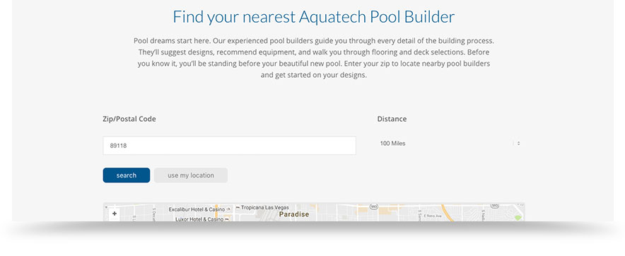
 Who is this kid?
 As we mentioned earlier, the point of the new responsive website is to attract and persuade sponsors for K-Rex. Thing is, the website is only the lure. K-Rex’s dad also needed the hook. So we designed a pitch presentation template so he could make his presentations to potential sponsors. Winning races is only half the battle. The other half is creating a professional brand that companies will want to invest in. We may not know a whole lot about open wheel, formula car racing, but in the world of professional branding, we are true champs.
 Unfortunately, the company’s initial name was protected by common law trademark and could not be used. So we put on our identity hat and went to work. Our creative director closely collaborated with the client to develop a name that reflected the mission—and had an available URL. Not so easy these days. But we landed on a winner: Insuralease. Note the two main components, insurance and lease, are right in the name—which makes it easy to remember. We then developed a logo and color palette that promoted trust and looked as modern as this new insurance idea. Onto the website design.
 Lastly, we made sure that our web design works across all platforms by using responsive web technology. Though this best practice has been around for a couple of years, many don’t realize the importance of responsive web design. Responsive web design basically means that a website’s content will automatically adjust to the width of a browser. So when you view a responsive site on your phone, you’ll notice that the menu suddenly becomes a drop down and content is aligned vertically. This way you don’t have to shrink and enlarge content to get around the site. With an increasing majority of people surfing the web on tablets and phones, it is critical that companies have a responsive website. We made sure that Insuralease does.
 Now about those web databases.
 All the news fit to post.

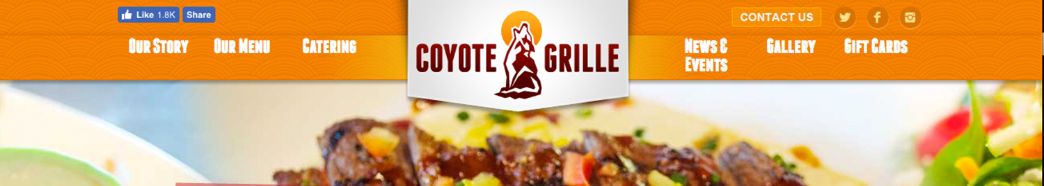 1. Imagery can make or break your
  2. Your site should feel like your restaurant.
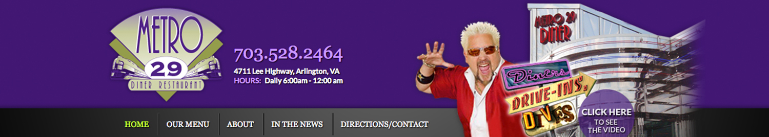 3. Tout your accolades.
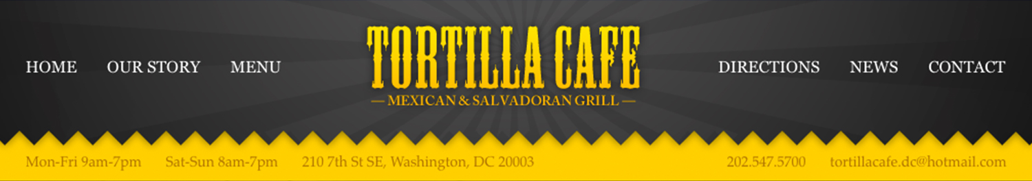 4. If you have a story, share it.