Since our educational adventure at An Event Apart in Washington DC this past July, we’ve discussed Website Accessibility and Measuring Engagement. Today, we’re diving into the ever-important realm of Image Optimization.
What is Image Optimization?
When Una Kravets, UI Engineer for Digital Ocean, began her AEA presentation with a full screen photo of Bob Ross, we knew this was going to be good. Essentially, Image Optimization is what makes a raw, high-resolution photo or graphic look good and load fast on the web. This is accomplished using various tools and practices, which we’ll get into later. Worth noting, we aren’t necessarily talking about the physical size of an image in inches or pixels here, but instead the file size in bytes.
Every time you visit a web page, your computer is essentially downloading the embedded images to view them. This consumes precious bandwidth on your hosting environment as well as your visitor’s browsing device. The goal of image optimization is to minimize the bandwidth required to experience a website.
As Google so eloquently puts it, “Image optimization is both an art and science” because there is a definitive yet subjective balance between quality and file size. In the example below, you’ll see our original photo on the left, straight from the camera, with zero compression or optimization. To the right, that same photo has been saved at 10% quality to significantly reduce file size.

With any image optimization, there is give and take. The higher the quality (more colors, finer detail) the bigger the file. There have been major strides in lossless compression that retain the depth and variation of photos. Such methods rely on extremely complex algorithms unique to each of the popular file types (JPG, GIF and PNG). Painting happy trees might make us smile, but image optimization is serious business.
Why it Matters?
You might ask yourself why this extra effort is necessary. You have a nice broadband internet setup at your house, so why bother with a saved kilobyte here and there? For that answer, you’ll have to step outside of your own home. When Una Kravets refers to “Responsible Imaging,” she’s talking about serving all audiences, across the world, on any devices, with a wide range of connectivity scenarios. Like her, if you believe access to information should be a basic human right, then image optimization becomes a top priority. If we look at mobile traffic alone, about 50% of all visitors are using a phone or tablet to browse your website – often from a 3G connection. Statistics show that 53% of mobile sites are abandoned after just 3 seconds. Can you afford to lose that much business due to slow page load times?

Additionally, search engines like Google are starting to place increased importance on page load times. Websites that load faster rank higher in search results and that will only become truer as expectations evolve. Just for fun, check out your current Google Page Speed Score.
According to Una’s HTTP Archive data, nearly 66% of a site’s total size is comprised of images. Stylesheets, scripts, HTML code, and fonts are barely a sliver on the pie chart compared to the bandwidth consumption of graphics and photos. Look around at the current trends in website design. Pages are adapting large, full-width images and big, bold graphics throughout for an impactful brand experience. With this movement comes an increased need to keep quality up and file size down.
How Image Optimization is Done
It’s best practice to get into the habit of optimizing your graphics before uploading. Again, there are a handful of great tools and software to make it happen, but it often requires a human touch to get just right. Starting from scratch is one thing, but optimizing a website that is already established and packed with images can be a real challenge. Doing so in a creative, innovative way is a whole new level of complexity. Luckily, ACS Creative is always up for the job…
Take a webpage we built for our client, B-FOR. The company provides international trade show and exhibit services. We designed their original website, and we recently expanded the site to include their Brand USA content. Brand USA encourages international travelers to visit the United States.
On one of the new Brand USA pages, we included dynamic images. Each time the page loads, a new header image appears. Normally, this would slow down a webpage. But we changed the typical way an image loads. The full image does not load all at once. For a split second, the image is blurry. This allows the rest of the page content to load, while the rest of the image catches up. Customers can see the content they need right away, without waiting those extra painful seconds for the page to load.
Optimizing the images on your site doesn’t always mean crunching the file size. Replacing icons and simple graphics altogether with web fonts is also an effective measure. Furthermore, uploading images that are no larger (in pixels) than their use on your site is equally crucial. For example, your logo file doesn’t need to be 900px wide if it never appears larger than 300px wide. Don’t serve an image that could be a font and don’t serve an image with unnecessarily large dimensions, and you’re already off to the races with your optimization efforts!
Tools of the Trade
Over the years, we’ve utilized several means of image optimization. Here are a few of our favorite tools and resources:
These will get you started, for sure. When experimenting with different image optimization services and settings, it’s important that you save the original graphic files separately. If you opt to utilize one of the WordPress plugins, be sure to backup your site before running any automated functions.
The Future of Image Optimization
Perhaps the most engaging element of Una Kravets’ presentation was her excitement about how far image optimization has come – and where it’s going. This fascination extends far beyond the current capabilities of common file types, but is also stunted by the limitations of cross-browser support. For instance, the WebP file format, which boasts transparency, better compression than JPG, as well as animation, or the Picture Element fallback, which controls responsive images based on the visitor’s resolution. WebM promises stunning open video compression with minimal loss. These are just a few examples, of course. The future is bright for image optimization, and we intend to remain at the forefront of progress.
We’d like to thank Una Kravets (@una) for inspiring us to share this fascinating topic with our readers and clients. Be sure to follow her for wonderfully whimsical insights on digital marketing, community building and technology.
How We Took a Website from Stuck to Stellar
When Kyro Systems came to us, they were at the end of their rope. (Somewhat odd, for a company that spends a lot of time hanging from ropes to install skylights).
They were redesigning their website and hit a wall. The project was dragging on month after month. Another web development firm (and we won’t name names) had built most of the website. The website didn’t look bad, but it also didn’t work. Overall, the site lacked organization and was difficult to navigate.
We meet a lot of clients like this. Clients who get most of the way down the road on a new website and need help over the last hurdles. We love picking up projects like these because we understand what it takes to build effective websites, not just pretty ones.
On Time, On Budget
A family business, Kyro Systems installs and repairs skylights and building envelopes in the DC area. They have worked on gorgeous buildings for prestigious institutions like the National Gallery of Art and the Ronald Reagan Building.
After sinking resources into a website that wasn’t working, Kyro had very little budget left to finish the project. We wanted to help them out of this tough spot, so we stuck to a tight schedule to launch an effective site without breaking the bank.
Our finely tuned web development process helps us turn sites around quickly. We present initial mock-ups, receive client feedback and then build out the final webpages from there. By following these steps, websites can be built and launched in a matter of weeks.
At ACS, we place a premium on direct communication. Unlike other agencies, we don’t have account middlemen. Our clients work directly with the creative team, so nothing gets lost in translation. This helps projects run smoothly and efficiently.
Words, Words, Words
To launch a website, you also need to write web-friendly content. This hurdle often slows down many companies. Web copy has to be shorter and easier to read than other types of content, and not everyone knows how to tackle this challenge.
Kyro sent us pages of text they had written about their services. We adapted the content, shortening the sentences and breaking up paragraphs. This way, website readers can quickly scan a page for the information they need.
Thanks to careful planning and client input, the new Kyro website is broken into simple, easy-to-understand categories. Though the original design was unorganized, the new website clearly guides people to relevant information on Kyro’s services, projects and contact information.
Preparing for the Future
The new Kyro Systems website provides a straightforward introduction to the company. But, as with any project, there is always room to grow. In the future, Kyro may want to use their website as the centerpiece of marketing efforts. With the foundation we set up, it will be easy for their team to expand the website whenever and however they choose.
We build all of our websites using WordPress, a popular Content Management System (CMS). WordPress has backend editing tools that allow you to update a website without needing to understand coding.
For instance, Kyro may want to set up a blog on their website. From there, they could share the content on social media or email the articles to their subscribers. In this way, they can keep their brand top-of-mind for valuable customers. The website we built makes this future marketing possible.
We’re so happy to have helped Kyro Systems get their new website up and running. We can’t wait what the future holds for their business!
Your Guide to Image Optimization
Since our educational adventure at An Event Apart in Washington DC this past July, we’ve discussed Website Accessibility and Measuring Engagement. Today, we’re diving into the ever-important realm of Image Optimization.
What is Image Optimization?
When Una Kravets, UI Engineer for Digital Ocean, began her AEA presentation with a full screen photo of Bob Ross, we knew this was going to be good. Essentially, Image Optimization is what makes a raw, high-resolution photo or graphic look good and load fast on the web. This is accomplished using various tools and practices, which we’ll get into later. Worth noting, we aren’t necessarily talking about the physical size of an image in inches or pixels here, but instead the file size in bytes.
Every time you visit a web page, your computer is essentially downloading the embedded images to view them. This consumes precious bandwidth on your hosting environment as well as your visitor’s browsing device. The goal of image optimization is to minimize the bandwidth required to experience a website.
As Google so eloquently puts it, “Image optimization is both an art and science” because there is a definitive yet subjective balance between quality and file size. In the example below, you’ll see our original photo on the left, straight from the camera, with zero compression or optimization. To the right, that same photo has been saved at 10% quality to significantly reduce file size.
With any image optimization, there is give and take. The higher the quality (more colors, finer detail) the bigger the file. There have been major strides in lossless compression that retain the depth and variation of photos. Such methods rely on extremely complex algorithms unique to each of the popular file types (JPG, GIF and PNG). Painting happy trees might make us smile, but image optimization is serious business.
Why it Matters?
You might ask yourself why this extra effort is necessary. You have a nice broadband internet setup at your house, so why bother with a saved kilobyte here and there? For that answer, you’ll have to step outside of your own home. When Una Kravets refers to “Responsible Imaging,” she’s talking about serving all audiences, across the world, on any devices, with a wide range of connectivity scenarios. Like her, if you believe access to information should be a basic human right, then image optimization becomes a top priority. If we look at mobile traffic alone, about 50% of all visitors are using a phone or tablet to browse your website – often from a 3G connection. Statistics show that 53% of mobile sites are abandoned after just 3 seconds. Can you afford to lose that much business due to slow page load times?
Additionally, search engines like Google are starting to place increased importance on page load times. Websites that load faster rank higher in search results and that will only become truer as expectations evolve. Just for fun, check out your current Google Page Speed Score.
According to Una’s HTTP Archive data, nearly 66% of a site’s total size is comprised of images. Stylesheets, scripts, HTML code, and fonts are barely a sliver on the pie chart compared to the bandwidth consumption of graphics and photos. Look around at the current trends in website design. Pages are adapting large, full-width images and big, bold graphics throughout for an impactful brand experience. With this movement comes an increased need to keep quality up and file size down.
How Image Optimization is Done
It’s best practice to get into the habit of optimizing your graphics before uploading. Again, there are a handful of great tools and software to make it happen, but it often requires a human touch to get just right. Starting from scratch is one thing, but optimizing a website that is already established and packed with images can be a real challenge. Doing so in a creative, innovative way is a whole new level of complexity. Luckily, ACS Creative is always up for the job…
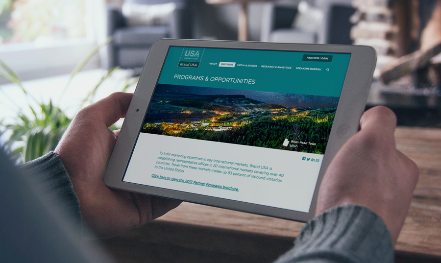
Take a webpage we built for our client, B-FOR. The company provides international trade show and exhibit services. We designed their original website, and we recently expanded the site to include their Brand USA content. Brand USA encourages international travelers to visit the United States.
On one of the new Brand USA pages, we included dynamic images. Each time the page loads, a new header image appears. Normally, this would slow down a webpage. But we changed the typical way an image loads. The full image does not load all at once. For a split second, the image is blurry. This allows the rest of the page content to load, while the rest of the image catches up. Customers can see the content they need right away, without waiting those extra painful seconds for the page to load.
Optimizing the images on your site doesn’t always mean crunching the file size. Replacing icons and simple graphics altogether with web fonts is also an effective measure. Furthermore, uploading images that are no larger (in pixels) than their use on your site is equally crucial. For example, your logo file doesn’t need to be 900px wide if it never appears larger than 300px wide. Don’t serve an image that could be a font and don’t serve an image with unnecessarily large dimensions, and you’re already off to the races with your optimization efforts!
Tools of the Trade
Over the years, we’ve utilized several means of image optimization. Here are a few of our favorite tools and resources:
These will get you started, for sure. When experimenting with different image optimization services and settings, it’s important that you save the original graphic files separately. If you opt to utilize one of the WordPress plugins, be sure to backup your site before running any automated functions.
The Future of Image Optimization
Perhaps the most engaging element of Una Kravets’ presentation was her excitement about how far image optimization has come – and where it’s going. This fascination extends far beyond the current capabilities of common file types, but is also stunted by the limitations of cross-browser support. For instance, the WebP file format, which boasts transparency, better compression than JPG, as well as animation, or the Picture Element fallback, which controls responsive images based on the visitor’s resolution. WebM promises stunning open video compression with minimal loss. These are just a few examples, of course. The future is bright for image optimization, and we intend to remain at the forefront of progress.
We’d like to thank Una Kravets (@una) for inspiring us to share this fascinating topic with our readers and clients. Be sure to follow her for wonderfully whimsical insights on digital marketing, community building and technology.
Nonprofit Websites: Your Mission, Our Vision
Nonprofit organizations have the distinct task of conveying and executing their missions on a tight budget—and those goals are of no less import than their for profit counterparts. We get that. With hubs across the DC Metro area (a hotbed of nonprofit organizations), we have decades of experience helping causes economically harness the power of the web to communicate information, raise funds and do more good with their nonprofit websites.
Inform and Educate
A modern, strategically-designed website can help you reach a larger audience on the internet. Older websites that are not responsive (meaning they don’t adjust content to fit all devices) don’t rank as high with search engines—if at all. Any company, regardless of whether it is nonprofit or otherwise, needs a website that shows up when people search. We’d argue though, that properly designed websites are even more advantageous for nonprofits because a little spend really goes a long way. Compared to other forms of advertising, investing in a website that is communicating who you are and what you do 24/7 is a very smart marketing move.
Fundraising Efforts
If your nonprofit depends on donations, then a website can be a valuable fundraising tool. You can pitch your cause online with stories, images and case studies, and give potential donors the ability to send funds instantly and conveniently. This creates a sense of immediate gratification–which can lead to more donations. If folks have to mail checks in, chances are they won’t.
We created such an opportunity for online fundraising for Fairfax Casa, an organization that pairs court appointed special advocates with the children that need them. Fairfax Casa relies on both donations and volunteers, so the website we designed for them has several red and dark blue buttons on the homepage that grab your attention and encourage you to act. The images of the cute kids really help the nonprofit’s cause, too. There’s a powerful story being told here, and that story pulls at the purse strings.
Serve Your Interests
While we often associate nonprofits with heartfelt causes, many have other equally legitimate agendas. For example, we designed a website for AAEI, the premier trade organization that represents US companies engaged in international importing and exporting. Conducting global business is a complicated affair. AAEI assists these companies by conveying the latest information on government regulations. They have members and hold conferences. What better way to collect and dispense information about laws and events than through a modern, easy to navigate website? And that’s exactly what we designed for them.
Event Promotion
The Federal Administrative Law Judges Conference (FALJC) is an annual meeting featuring seminars and other networking opportunities. The website we designed for them makes it easy for visitors to find other members, meet the officers and learn about upcoming events. There’s also a message board for folks to address common concerns. The clean website design really allows the information to be the hero, which is perfect for FALJC. We don’t believe in flash for flash’s sake.
Measuring Engagement
This is our third post in a series on the web design and development conference, An Event Apart. After you learn about measuring engagement here, read up on improving website accessibility.
There’s a popular meme we like. The image shows a beautiful brick walkway, designed to get park visitors neatly from point A to point B. Right next to the walkway, there’s a dirt path, well-trodden by people who have ignored the intended route.
This meme perfectly demonstrates how users behave on your website. Some will take the beautiful path you laid out for them. Many more will move through your site in ways you never predicted. As we’ll explain in this post, effective web design isn’t about controlling your visitors – but adapting to how they behave on your site.
We all wish our website visitors would follow the paths we laid out for them. We wish they would find what they need quickly and painlessly. We know that’s not always the case. So what do you do about it?
One guy might have the answer. Gerry McGovern (@gerrymcgovern) helps companies improve their customers’ experiences online. He capped off DC’s An Event Apart with his presentation, “Measuring The Customer Experience.”
During his presentation, Gerry showed us different examples of less-than-ideal customer experiences. He then explained how he helped resolve those problems with research, testing and analysis.
He opened with an example from Canada’s travel website. As you can imagine, it was difficult to manage, with different government agencies contributing to different parts of the website.
With testing, they found that visitors were having trouble finding information on travel documents for tourists. They expected users to look under “Immigration” for this information, but tourists did not know to look there. By moving the content to the “Travel” section instead, many more site visitors found what they were looking for successfully.
Why does measuring your customer experience matter?
As with the Canada website example, it is important to keep in mind what your website audience actually does, not what you want them to do. That way, you can keep them on your website longer, even though attention spans online have never been shorter.
As Gerry put it, we expect our Amazon deliveries within hours of purchase. We expect websites to load in milliseconds. In that way, we also expect information to be available instantly.
Gerry was quick to point out that wait times are your competitor’s opportunity. The longer it takes to find valuable information on your website, the more frustrated they’ll be. If your website is hard to use, customers will abandon you pretty quickly.
How do you prevent this frustration? First, you need to identify customer pain points. These are the blind spots on your website that slow down your customers and hurt your bottom line. To find these frustrations, you can run tests to measure how quickly customers can find key information on your website.
How do you set up these tests?
Creating these sorts of tests is easier than you think. Gerry outlined a few key steps to help get started.
Keep your sample group fairly small. You only need 13-18 people in order to get reliable results from your tests.
Set up a simple testing environment. You don’t need a fancy lab to learn more about your customer’s experience. You should have the customer at one computer and a proctor following along at a second computer.
Carefully design your questions. Have them track down specific information on your website; there should only be one possible answer for each question. Your questions should be short, 20-30 words max. You want to be clear, but you don’t want to give them too many keywords or clues on where to find the answers.
Have target goals in mind. See how quickly customers can complete the tasks you designed. The target times should be somewhere between 20 seconds and 2 minutes.
How do you measure success?
With these tests, you should be able to see which tasks tripped up your customers. Don’t worry too much about outlier results. Instead, look for patterns. See which parts of your website could be improved based on these pain points.
If you need to sell these improvements to management, Gerry recommends showing videos of customers trying and failing to complete the tasks you designed. By combining data and empathy, you can overcome office politics and make real improvements to your site.
More Addy Awards for ACS!
For the last three years running, ACS Creative has earned the accolades of its industry peers. We are grateful for the judges who think so highly of our work, and we are doubly grateful for the clients who trust us with their brands and allow us to do great things. Our Addy Awards (Addy’s) are not the result of one creative mind. It takes a team effort, agency and client working together, to develop ideas that lead to designs that garner awards. You might say the real winner here is our customer service. You also might say that three years of wins means we can proudly state: ACS Creative, an award-winning branding agency. We hope you don’t mind if we do.
But wait, what is an Addy Award?
For those of you unfamiliar with the moniker, Addy is the affectionate nickname given to the awards presented by the American Advertising Federation (Ad Club). The annual event, which draws over 40,000 entries per year, is the advertising industry’s largest and most representative competition. Ad Club recognizes winners through a tiered system at both local and national levels. The Addy’s primary mission is to recognize smart, artistic and creative work across the U.S.
It’s an honor to be included among the distinguished group of agencies that were recognized for their outstanding work in 2016.
Our award-winning entries.
ACS Creative has been developing successful brands for clients for decades. It was no surprise then that the judges chose to give us two Addy Awards in the areas of branding & identity. The third win was for web design — one of our core competencies. It is particularly satisfying to be acknowledged for the things you do well. The ACS team spends much time honing their design skills and staying ahead of industry trends and best practices. Not to win awards, but to help our clients meet their business goals. The trophies are just icing on the cake!
About that award-winning logo.
The logo that garnered the most acclaim was designed by us for a company named Britepaths — which was a new name as well. The company, originally called Our Daily Bread, has been around for more than 30 years and is dedicated to developing sustainable solutions that meet the challenges of low-income working families through emergency assistance, financial literacy and one-on-one mentoring. A great cause worthy of a great logo. We went to work gathering brand insight, developing a name and finally crafting a logo. The process was harmonious collaboration between agency and client. It couldn’t have gone smoother. Probably why the end product turned out so good.
Here’s the winning logo. We like it and, more importantly, Britepaths likes it!
So what makes a great logo?
First, the research that goes into it. You need to understand the industry, the brand’s history and the competitor logos already out there. Then you start designing. You draw out several options. You revise them. You throw some out and you finalize some others. Then you get the client involved for feedback. Repeat until logo is finished. That finished logo hopefully dovetails with what great logos have in common:
Trust us, it’s not as easy as it looks—which is why we are so pleased with our Addys. Hard work does pay off.
Your Website isn’t Safe, and Google Knows It
*You’re going to want to pay attention to this.
Upcoming Chrome changes will affect millions of non-secure web pages, including yours.
Big changes are coming to Chrome, Google’s web browser, in just a few months. The browser will flag any web forms that do not have a Secure Socket Layer (SSL) Certificate installed as non-secure. That warning will drive viewers from your contact page, e-commerce checkout, and any page where you ask for customer information.
Chrome is currently the most popular web browser in the United States with 44.71% of internet user market share.
What are SSL Certificates?
They are small data files that encrypt information online. This helps prevent third parties from intercepting vulnerable user data. You purchase and install an SSL certificate to build a strong, secure connection between a web browser and a web server. Once an SSL certificate is installed, a web page changes from HTTP to HTTPS.
Eventually, every non-secure/non-HTTPs page visited in Google Chrome will have a red triangle next to the URL, warning customers that the page isn’t secure. It’s part of Google’s broad strategy to make the web safer.
The search engine giant is taking the next step in this epic web security plan. In October of this year, Google Chrome is laying down the law on website forms.
But don’t panic (at least not yet). We can help you work through this major security update. Here’s what this change means for your website and your business…
What is Going On?
In January 2017, Google Chrome added a non-secure warning to all pages that collect payment and/or password information. This was the first step in Google’s plan to push all websites to adopt HTTPS.
October’s change marks the second step in this process. “Not secure” warnings will appear on pages that ask people to enter ANY kind of information, not just sensitive payment data.
Google wants every website to have an SSL certificate – and that’s a good thing. It will protect you from potential cyber threats while giving your customers peace of mind.
Why Do You Need to Pay Attention?
You want your customers to feel safe on your website. Non-secure pages will drive customers away.
Whether you’re a retail store or a law firm, you want people to get in touch with you online. If you don’t have an SSL certificate, customers will see this new Google warning on your contact page, or anywhere else you ask them to send you information.
That means that your contact form to your sales team will be flagged as non-secure. Your request for an email address so your marketing department can build effective campaigns will seem unsafe. The employee intake form from your HR department will actually drive top qualified candidates away from your organization. All because the data that you are asking for is being transmitted in an non-secure, unencrypted manner making it vulnerable.
Besides the obvious security benefits, an SSL certificate could also help your SEO. Google’s search algorithms favor HTTPS websites. Your website could rank higher in search engine results if you have this extra protection.
You can also stand out from your competitors by adding an SSL certificate. Google’s October updates will likely catch a lot of companies off-guard. Customers would probably choose your secure website over a competitor’s non-secure site.
What Can You Do about It?
If your website does not have an SSL certificate, NOW is the time to get one. This small investment can make a big impact.
It’s not terribly difficult to install an SSL certificate, nor is it especially intuitive. You can add one yourself, or you can have a web developer install it for you. There are many companies that sell this service, including ACS Creative.
In preparation for the Google Chrome change, you should apply an SSL certificate to your contact form. Even if you’re only asking for an email address, you need this HTTPS page to avoid the dreaded non-secure warning.
Thinking ahead, you may want to apply an SSL certificate to your entire website. That way, you’ll be covered when Google Chrome does decide to add scary red triangles to all HTTP pages. Though Google won’t say when they’re taking that bigger step, the change is coming sooner or later. You want to be prepared when it does.
We’re Here to Help
Unsure what to do next? Our developers can setup your SSL certificate the right way. We can keep your website secure and your customers happy with our Website Oil Change.
[gravityform id=13 title=false description=false ajax=true tabindex=49]
New Security Training Website Hits the Mark
What does it take to build a good website? What does it take to make a good website great?
As website designers, it’s sometimes tough to know the answers. Our client O’Gara Training came to us with a good, solid website. We helped them make it better. Their new website not only helps customers learn about O’Gara (the key function of any site), but it also sets up the company for future growth and success.
Go with the (user) flow
When the O’Gara team came to us, they knew their site wasn’t addressing the needs of all of their customers. The company trains clients on how to manage dangerous scenarios. From highway emergencies to explosions, experienced trainers cover a broad array of crises.
We had a blast (pun intended) when we visited one of O’Gara’s training facilities. Our gracious hosts taught us to shoot firearms and drive on slippery roads. We saw first-hand that these practical courses could help so many people, but their old website focused mostly on military training.
In reality, O’Gara serves NGOs, government contractors, corporate executives and many other non-military clients. With the new website, we had to communicate with these different audiences without alienating any one industry.
Keeping the customer industries in mind, we created specific user flows. A user flow (or conversion path) is the journey someone takes as they navigate a website.
We completely restructured the O’Gara Training website to create these user flows. From the second someone lands on the new website, they are led to pages specifically designed for their needs. The homepage has four neat blocks for each customer sector: Individuals; Corporations, Organizations & Institutions; Governments, Military & Police; and Non-Governmental Organizations. Each audience has a custom webpage, addressing the unique security needs of their industry.
New logo for new markets
To complement these new user flows, we refreshed the O’Gara Training brand. Their old logo had a strong military feel, with its green color and traditional serif font. The new logo had to attract military and non-military industries at the same time.
Our designers created a modern logo for O’Gara, with a clean sans serif font and a neutral brown color. It communicates the serious tone of O’Gara’s business, while appealing to a broader array of customers.
We incorporated this logo and brand scheme throughout the new website. We also designed a PowerPoint presentation and email to support the renewed brand. All of the branded marketing materials work together to deliver a cohesive message to customers.
The new brand also helps distinguish O’Gara Training from its parent company, The O’Gara Group. The training division now has room to grow beyond the company’s security roots to branch into more commercial sectors.
Laying the groundwork for growth
Websites tell customers who you are. They also tell customers who you want to be. We built the O’Gara Training website to help the company expand down the road. Our developers included back-end tools to allow O’Gara to easily add new services to the website any time.
The old website put their training facilities front and center. But we all know physical locations don’t matter as much anymore thanks to digital technology. The new website focuses more on services and customers, rather than locations. That way, O’Gara can offer online courses, without needing to connect the course to a physical training center.
We’re proud to have been apart of O’Gara Training’s new website. We hope to visit their training grounds again soon, and we’re excited to see how the new brand helps their business grow.
Ready for a New Website?
If your site could use a new look, get in touch. We can take websites from good to great. Let’s have a conversation!
[gravityform id=12 title=false description=false ajax=true tabindex=49]
An Opportunity for Website Accessibility
A couple weeks ago, the ACS team attended An Event Apart in Washington DC. This post on accessibility is the second in a series about our takeaways from this web design and development conference. In case you missed it, check out our first post in the series on what makes industry conferences valuable.
A Story of Inclusion
For this AEA post, we’ll be highlighting Derek Featherstone, founder of SimplyAccessible. In “Where Accessibility Lives,” Derek led our journey through the eyes of an imaginary company called incrediWeb. This theoretical e-commerce startup was receiving user feedback that didn’t quite align with their perception of the incrediWeb site. For example, “the buttons are too close together” or “there is too much background noise in the video.” After several submissions of this nature, it became apparent to the company that their website had issues that made browsing (and buying) difficult for people with disabilities and personal restrictions.
The diligent team at incrediWeb knew accessibility was the answer, but they were faced with a whole new realm of questions… Whose job is this? Where do we start? What are we missing? How do we fix it? With virtually countless possibilities on the other side of the screen, it can certainly be daunting to plan for and satisfy all scenarios. According to Featherstone, the process can be broken down into three digestible steps:
From internal awareness to auditing their website to solving nearly 300 accessibility issues, incrediWeb utilized these steps to work toward an optimized experience for all visitors. It takes time – it takes testing – and it takes perspective, but the end result is well worth the effort. Derek left us with a quote he began his presentation with, now received with even greater meaning:
Website Accessibility in a Nutshell
Let’s touch on the basics. Essentially, Website Accessibility isn’t a black and white concept (and we’re talking beyond the parameters of 508 compliance here). It’s not something you either have or don’t. It’s something you work toward – one page, one image, and one pixel at a time.
There are many steps designers and developers can take to ensure a website’s content is easily readable and navigable to those with special browsing needs. For instance, you might assume blind people don’t use the internet. Well, they do. How do you think one of the world’s 285 million visually-impaired people would fare on your website? Fortunately, as online standards and technologies have evolved, so has our understanding of addressing challenges like this and many others.
Derek introduced the scenarios of paraplegia, quadriplegia, farsightedness, nearsightedness, color blindness, dyslexia, hearing impairment, and the list goes on. It may not be possible to serve every single user an equally brilliant experience on your website, but your goal should be better – not perfect. Take the first step TODAY and implement these five simple, universal accessibility best practices:
It’s not difficult to make accessible choices in your code and design. The challenge is being aware of your visitors’ potential obstacles and addressing them effectively. Often, this requires research – something Featherstone believes in strongly. Your best guess might be better than nothing, but it’s not nearly as valuable as real feedback from real users.
Our Experience
ACS designers and developers have hands-on experience creating accessible websites. One of our non-profit clients, Child Care Aware of America, helps parents find affordable childcare nationwide. When building their new website, we took extra care to ensure the site was easy to use for everyone.
Although it’s important to “aim for better” as Featherstone says, you sometimes have to aim higher when it comes to accessible website design. Our team built the Child Care Aware of America website to be 508 compliant. This refers to Section 508 of the Rehabilitation Act of 1973, which requires government-funded websites to be accessible to people with disabilities.
We deployed all of Featherstone’s best practices when designing this website. For instance, we avoided vague calls-to-action like “Learn More” in favor of more descriptive statements like “Read about summer care.” Our designers also used colors with significant contrast, to make sure text blocks were easy to read.
Unfortunately, there isn’t an automatic test to determine if a website is 508 compliant. There are no robots programmed to review your site. A person takes a look at each site and decides on a case-by-case basis if the website meets the law’s standards. However, if you take the right steps, you can build an accessible and compliant website. In the end, we’re proud to say that the Child Care Aware website passed the test and is 508 compliant.
Accessibility for All
What makes the web great is its universality. It connects, empowers and enlightens people from all walks of life in every corner of the globe. However, for technology to truly bring humanity together, it must be accessible for all.
As you know by now, we tend to get a bit carried away when talking about the awesome power of the internet. We’re not saying a site that sells pineapple t-shirts is going to change the world, but it does have the opportunity to provide an equally-friendly user experience to each of its visitors – and that goes a long way.
We’d like to thank Derek Featherstone (@feather) for his insightful wisdom and passion for website accessibility. Its importance will only grow by the day, and we look forward to making it our personal priority moving forward. Stay tuned for our next AEA post about progressive web design!
Giving Healthcare Websites New Life Online
Healthcare websites are critical business and marketing tools in the medical arena. If yours isn’t driving-up patient numbers and facilitating workflow, then you might need a new one, stat.
When it comes to healthcare websites, ACS has the cure.
At ACS Creative, we have designed and developed dozens of websites for large healthcare companies, specialty practices and solo practitioners. We understand your specific challenges and use our deep expertise in healthcare marketing to create sites that solve them. Our mission is to allow you to focus on what you do best: building healthcare networks and healing patients.
Take control of hospital networks and healthcare infrastructure.
Let’s say you’re an insurance company with information that needs to be delivered to providers, individuals, and facilities in a secure and efficient manner. At ACS Creative, we’ve got just what the doctor ordered. Our healthcare websites can be designed to address all audiences and manage multiple portals of data.
In fact, we did just that for Signature Partners, an integrated provider network. Patients, providers, payers, and other groups can easily access information pertinent to their needs. Doctors can learn about the benefits of joining Signature Partners while patients can search for in-network providers near them.
For InTotal Health Providers we took it a step further than just a healthcare website by creating a robust back-end provider platform for registrations and claims. These kinds of online tools help businesses streamline their operations – which increases bottom lines. The upfront costs far outweigh the endless financial advantages you’ll reap over time.
Tout medical innovations. People want to know.
Consumers search for medical information ALL THE TIME. As a forward-thinking member of the healthcare industry, you can use this to your marketing advantage. Having a blog that offers tips on common illnesses or first aid is a great way to drive traffic to your website and build brand awareness, both locally and nationally.
If you’re an oncologist, for instance, offer your take on the latest cancer research findings. If you’re a pediatrician, give new parents guidelines on care. The more valuable the information on your healthcare website, the more likely people will discover it, see your expertise and schedule an appointment.
Similarly, you may be a company pioneering innovative medical treatments, like our clients Scandic Health and Aretech. In this instance, a website can be an invaluable tool to help spread the word about your products and services. For Scandic, we designed a modern website that delineates all the benefits of MusiCure and gives visitors the ability to learn more, listen to a sample AudioCure and contact the company. For Aretech, we used how-to videos and sliding feature sections to communicate their product’s benefits in an engaging way. So far, the prognosis for both websites has been very good.
Everyone needs a doc. Help them find you.
If you own a practice, you need a website that attracts new patients and keeps current ones coming back. That means your website needs to be mobile and tablet-friendly for those increasing numbers of consumers who research on the go.
Of course you want them to find you, but if your site isn’t mobile-friendly, Google will ensure that they don’t. This is Google’s rule, not ours, but our web design team knows how to build websites that major search engines love. At ACS Creative, we are also skilled at SEO and online marketing – which means we can help practitioners, clinics, insurance providers and other healthcare companies outrank the competition.
Set appointments, facilitate claims and more.
There are a number of medical practice functions that can be solved with intuitive healthcare website design. First, we can ensure that your office hours and ways to make an appointment are clearly denoted on the homepage. Nothing is more frustrating to people who need to make a doctor’s appointment than hunting around for basic information.
Check out this website design for South Riding Pediatrics. We highlighted hours and phone numbers in a sidebar that appears on every page. The appointment phone number is also in the header, site-wide. Parents with sick children have little patience for cumbersome websites, so we designed this one to be super user-friendly.
If budget allows, we can also build a custom appointment setter that integrates with your current appointment calendar and updates in real-time. This way, people can conveniently make appointments online anytime.
Submitting insurance claims, checking on their statuses and paying bills can also all be handled through your website. Imagine the time and paper your practice or clinic can save when you automate these functions through your website. Plus, it’s these kinds of conveniences that really drive loyalty and new patient acquisitions. For both patients and doctors, healthcare websites are all about efficiency.
Head over to see our portfolio full of our work in Healthcare Websites and much more!
3 Reasons Why We Loved AN EVENT APART
There is a Japanese concept called kaizen. It means constantly improving, always growing. It’s a great way to approach any part of your life, especially your work. ACS Creative embraced this philosophy when we attended the well-known and well-respected conference, An Event Apart.
The three-day Washington, DC design conference brought together hundreds of designers, developers and industry professionals from all over the country for expert insights into the latest web trends. Celebrating its 10th year, An Event Apart curated an impressive lineup of accomplished speakers from the creative field to share their glimpse into what’s next. Like our fellow attendees, we were there to absorb industry tips like a sponge — and that’s what we did.
It’s not often we pause our busy days at the office for a company excursion, but we couldn’t pass up an opportunity to share exciting new ideas with our current (and future) clients. We appreciated the chance to reconnect as a creative team and prepare for the latest developments in web design. Here are just three of many reasons why we loved An Event Apart.
1. Learned the latest industry trends
In the world of web design, nothing stays the same for long. That’s why it is important to stay tuned to new developments in web apps, internet browsers and other ever-changing technology. It was tremendously helpful to get insider tips on the latest design news, directly from experts at the top of their field.
2. Strengthened our team
There’s nothing like back-to-back sessions on content, CSS, coding and other best practices to bring your creative team together. After every session, we found ourselves brainstorming new ways to improve our clients’ websites.
How can we compress images so pages load faster? How can we apply this Progress Web App technology for better mobile experiences? How can we make our sites more accessible for people living with disabilities? We asked ourselves these questions, inspired by talented speakers like CSS guru Rachel Andrew and mobile web expert Jason Grigsby.
These rapid-fire conversations not only made ACS stronger as a team, but it also made us better prepared to serve our clients.
3. Shared insights with our clients — and with you!
As much as we value professional self-improvement, we value our clients even more. We want to stay sharp to make sure they have the latest and greatest tools at their disposal.
We don’t want to keep all of the great industry practices to ourselves. We want to share our insights with you too! That’s why over the next few weeks, we will be publishing a series of blog posts on what we learned at An Event Apart and how it applies to your business. Be sure to follow us on social media and check back often for more exclusive content like this!